
-
 sigma psi zeta infographic poster designAn infographic process flow poster geared towards women interested in joining a particular sorority. Limitations included only using images designed/created myself and adhering to the organization's brand and aesthetic. Designed for print using Adobe Illustrator.
View PDF of final design [147KB]
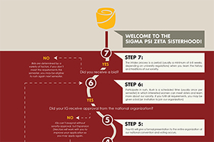
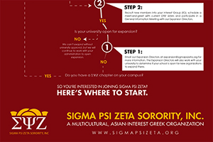 When initially developing the concept for the infographic, I consulted Sigma Psi Zeta's style guide to ensure I was adhering to their brand aesthetic. I first used their primary red for the background of my infographic, not realizing this shade of red was not ideal for printed materials. After viewing the first printed result, I revised the color scheme utilizing their secondary colors. This first draft also shows a different direction for the typography of the infographic.
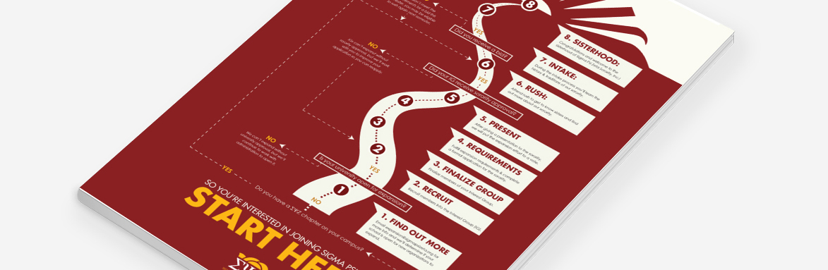
 To tie the infographic into the organization and really make it part of their brand, my original concept had the flowchart follow the growth of a yellow rose (the sorority's flower) from a root to a flower in bloom. After the reminder that roses actually grew on bushes, this idea had to be scrapped. It was a disappointing moment in the design process, but one that ultimately pushed me to a better final product.
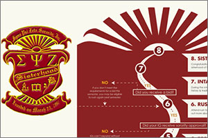 The final design really focused on the motif of the sun with 10 rays, another one of the sorority's symbols. I mimicked the sunrays directly from the organization's own crest (far left) to give it familiarity, but modified it for a more modern take on the design. Since the overall infographic was really following an individual's journey to join the organization, the final design of the winding road to the sunset was clear even to those unfamiliar with the organization and the brand.
View PDF of final design [147KB]
 art of now magazine spreadA magazine spread emphasizing a specific typographic topic. In this case, the focus was on designer Alicia Eggert and her sculptures on the subject of temporal typography. Designed for print using Adobe InDesign.
View PDF of final design [131KB]
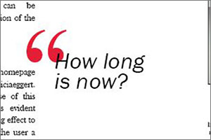 When given the opportunity to explore any topic in the field of typography, I had an idea of the direction I wanted to go from the very start. I myself have experience in many different areas of design, and one thing I enjoy doing is bringing those unique things together to create something entirely new. That is the concept behind the topic I explored in this magazine spread. The focus was "temporal typography" (also known as "transitional typography"); typography or typographic work that changes over a period of time in a variety of ways (be it typeface, weight, position, motion, etc). I eventually found myself drawn to sculpter Alicia Eggert, as her work used time in truly innovative ways.
 After deciding on a subject, I was tasked with designing a magazine spread to briefly highlight the topic of my choosing. Given my topic was something reliant on time (which often went hand-in-hand with motion), I had the additional unique challenge of capturing this dynamic art in a static form. I was eventually able to capture this motion by taking screenshots directly from video of the work in motion to capture the blur effect from the initial project, and incorporating this into the headline of the article.
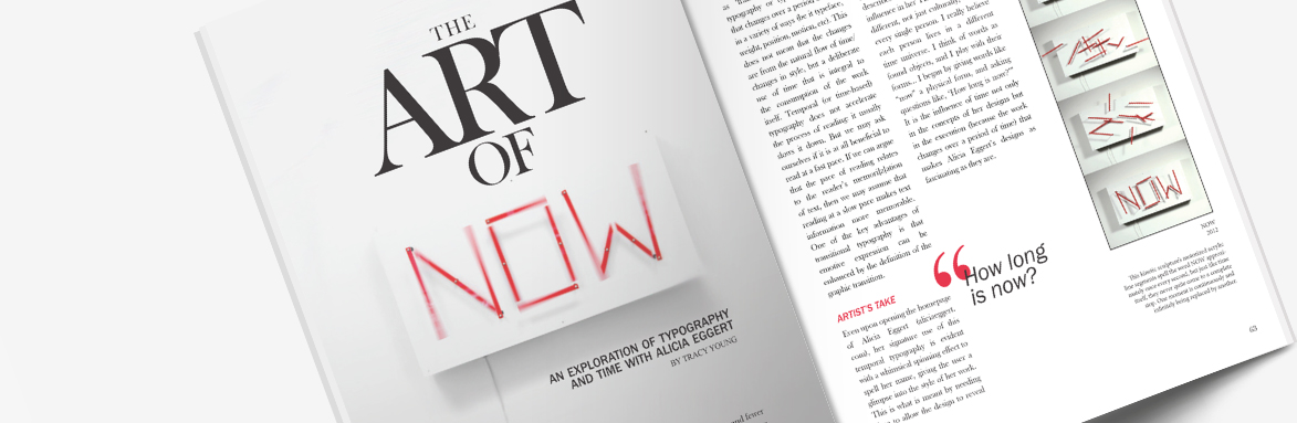
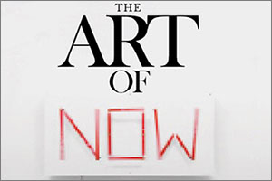
 While the main image of the magazine spread captured motion from the sculpture piece, it did not fully convey the way it moved. Capturing the work at various stages of motion allowed for greater understanding of a work that was meant to be viewed in real-time.
View PDF of final design [131KB]
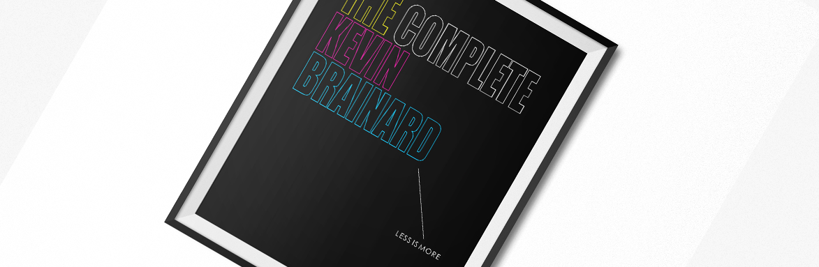 graphic designer book coverA design in a series of book covers inspired by a modern graphic designer's style. In my case, it was the style of designer Kevin Brainard, drawing in particular from his contributions to Consumer Reports magazine's 2014 redesign. Limitations included only using images designed/created myself. Designed for print using Adobe InDesign.
View PDF of final design [49KB]
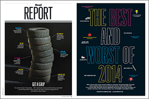 In one of my classes at George Mason, we were asked to develop a series of book covers showcasing a modern graphic designer, but we had to choose someone who's style spoke to us in some way. I had recently gotten the (at the time) latest issue of Consumer Reports magazine, which had just overgone a dramatic change, which I absolutely loved. The images at left are two examples of designs in the magazine that added a playful twist on a magazine with typically a more traditional style.
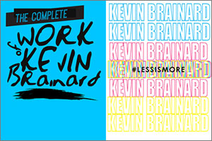 Inspired by this magazine redesign and the use of bold colors, I did some research into who was behind the Consumer Reports redesign and discovered the work of Kevin Brainard. There were many peices on his portfolio site that I appreciated and even used as inspiration for some of my first drafts (at left). Ultimately, however, my drafts always gravitated back to the Consumer Reports redesign that had drawn me to his work in the first place.
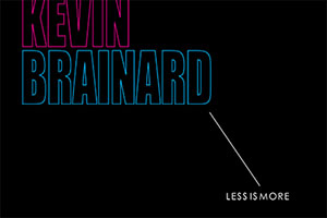 The final design drew directly from different aspects of the Consumer Reports magazine redesign, including the use of a CMYK color palette. The bright magenta, cyan and yellow made a bold statement on a pure black. Additionally, I included elements reminiscent of some of the diagrams found in the magazine by using a simple line to draw emphasis to a quote found on Kevin Brainard's own Twitter: "less is more". Given the white space surrounding it, the quote made sense not only for the designer's aesthetic, but for my design as well.
View PDF of final design [49KB]
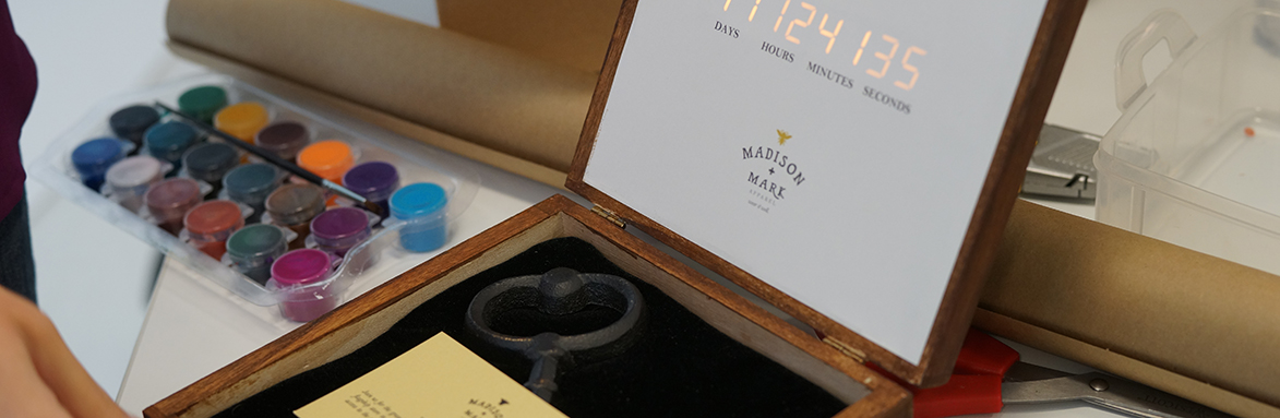 corporate branding promotional mailerA promotional mailer box that includes a countdown timer to the business' event. All aspects—company name, logo, branding, electronics, 3D printing—were developed autonomously. Programs included Adobe Illustrator, 123D Design, Arduino.
View JPG of final deliverable [147KB]
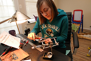 The project was to develop a promotional mailer for a fashion company. Having explored basic electronics, I was set on incorporating this somehow into the mailer. After a few rejected ideas, the idea of a countdown timer became a concept that was clever and executable for the mail. The first step was to develop the countdown timer itself, which was done with Arduino and Adafruit.
 After developing the timer, the electronic components were fitted into the top portion of a box. The electronics were hidden behind a piece of wood that had a single cutout for the numbers of the countdown and was set flush against the lid of the top of the box and covered with a branded design. In the bottom of the box was a plush velvet bedding (all created from scratch) for a key, with a card insert to explain the promotion. The outside of the box was sanded, stained and adorned with a 3D printed brandmark of the company.
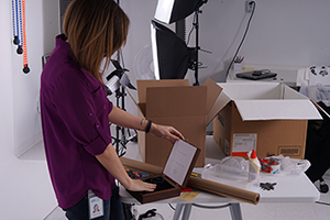
 In order to mail the box, the box was placed inside a cardboard mailing box filled with shipping popcorn and wrapped with simple brown paper with twine. Using a large, 3D printed version of the company's brandmark (a bee), I created a stamp to brand the outside of the package. To complete the project, it was mailed via USPS and arrived at its destination in working order.
View JPG of final deliverable [147KB]
Large 1234 x 823